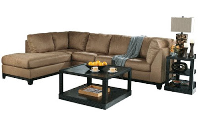
Before:

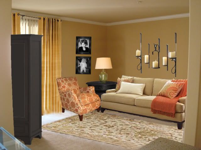
After:

My first real design challenge came from super, fun, exciting, and stylish Tawny in California. She simply emailed me with a picture of her apartment's empty living room and said, "Have fun!" And boy, did I have fun. I emailed her back and asked her if she had a budget, some style guidelines, and maybe a favorite color to go off of.... I didn't get a reply.
Over $12,000 later, I designed this room with its sophisticated coral accents and beautiful framed portraits.

As you can see, the room I designed is nothing like Tawny wanted. I had fun shopping at Pottery Barn and a few other online stores. The whole look I created in my first attempt looked too catalog-y. It reminds me of the Friends episode when Rachel buys furniture from Pottery Barn, but tells Pheobe she got it at a flea market because Pheobe hates the fake look of Pottery Barn. I think a really beautiful room evolves when a person puts their treasures into a space, not just Photoshop Gone Wild, by Danielle.


I contacted Tawny with my finished design and told her how much she owed me for all the furniture, accessories, and dupanie silk drapes. She replied, "Didn't you get my second email?"
After scouring my junk email file, learning a bit too much about how to get black-market viagra, and financial advice from my 4th cousin in Nairobi, I found Tawny's almost-lost forever email with a budget and a few specifications:
- Very cheap budget I don't mind DIY projects.
- I really would like a sofa sectional with a lounger (attached). Guess I would have to get it mini sized for the apt. Also, I am hoping for a chair that reclines as well.
- I like the wood to be dk brown and the accents to be beige, taupe; jade, teal, and mint green and ivory. A bright accent color would be violet.
- I'm a sucker for mosaics.
- The budget is $300 not including the couch, but should include something for the walls that I can't paint.
- My style is clean and classy/comfortable and modern. I found a quick photo. With the right color, I like this living room.
She attached this photo:

As you can see, the room I designed is nothing like Tawny wanted. I had fun shopping at Pottery Barn and a few other online stores. The whole look I created in my first attempt looked too catalog-y. It reminds me of the Friends episode when Rachel buys furniture from Pottery Barn, but tells Pheobe she got it at a flea market because Pheobe hates the fake look of Pottery Barn. I think a really beautiful room evolves when a person puts their treasures into a space, not just Photoshop Gone Wild, by Danielle.
I've known Tawny my whole life and after looking at the pictures she sent and thinking about her room, I came to a conclusion: she doesn't need me. After all, I have no training in design and my own experience has me painting and repainting, dream and scheming with next to no cash. Tawny has great style, so why did she ask for my help? I think all of us get stuck sometimes, even those with great taste, and it is nice to have someone push in the right direction. Or blame if the finished look turns out terrible.
Enter my free advice.
I think the idea of an "inspiration room" is a good idea. I keep a folder of magazine pictures that I love and want to remember. I also have a folder on my computer so I can save online images to drool over later. When it is time to actually make design changes/additions in my home, I can look at the pictures and see what elements I can use. In Tawny's picture above I noticed,
- understated, neutral couch.
- classic chair with a pop of color.
- a big print for the curtains that seems to be the inspiration for the whole room.
- pillows on the couch that reflect the colors in the curtains, add linear texture, and incorporate the "small", "medium", and "large" pattern that decorators always recommend.
- wimsical, 3-d pillows. Super cute.
- modern lines of the tables mixed with soft lines in the round mirror (hard edges), curtains, flowers, lamp, and pillows. The whole balance of textures works on this space.
For Tawny, I would take the design elements that inspire her and incorporate them with colors she loves. In the real-life apartment, Tawny can't paint the walls and hanging silk dupanie drapes from the ceiling would break the budget for sure. I would start by finding a printed fabric and take colors from it to create the rest of the room. Just a yard of fabric would be enough to create some art for the wall.
Here are a couple do-it-yourself projects that will give Tawny's room some custom-designed flair and won't break the bank like Pottery Barn:

The pillow on the left is similar to the flowery ones pictured in the inspiration photo. Check out the link on how to make it at Design Sponge. I am certain I could find something that looks even cooler or even make one myself if I had 3 less little people biting at my ankles.

A great idea for modern art that is swanky and super inexpensive is to cover art canvas with fabric or wall paper. See a tutorial at Thrifty Design Chick. If Tawny did something like this and hung it above her neutral sofa and added some whimsical pillows, the room would look dynamite in no time and for very little money.
I know for sure that Tawny has some skills in the area of design (something in her college degree and career choice led me to believe this). I don't need to say "buy this certain lamp and this certain chair." I am actually really looking forward to seeing what Tawny does with the space and her budget. These are my recommendations:
- write down what you love in a photo (or a bunch of different photos, what elements keep popping up?)
- keep a swatch of your fabric or paint chips with you while you shop.
- shop second hand stores and try to think of ways to re-purpose items. Like, if a lamp has great structure, but has an ugly color and lamp shade, buy a can of spray paint and change the color and get a new shade.
- remember the small, medium, large (and sometimes extra large) pattern/print rule. It works every time.
- add texture to the room with different shapes.
- send me the "after" pictures!


3 comments:
Alysun-- you are too precious! This isn't because I was shocked by the coral is it? Haha. Seriously, I am touched by the advice, investigation and effort you've giving to my living room. I really have a blank canvas in that room so I am going to take your biggest advice to find a muse print first and then design around it. Also, you are the very first to tell about the 3 print rule. You are so talented and invaluable to me. Thank you for your faith in me-- I have some work to do!!
After pictures might take awhile as you can see my budget means I am going to do a lot myself. I can't wait-- I hope you'll be proud!
So I love looking at your blog. I finally set up a blog of my own and now i can comment on yours. I wanted to tell you that we are getting ready to buy a house and I will need lots of decorating tips, so i will keep you in mind.
I enjoyed looking at your design. I think I have the same rug in my living room! (the one from your own desing). Kelsey
Post a Comment